Date Range Field Component
Changed on:
6 Sept 2024
Overview
This document describes the Date Range Field Component properties and sample usage. The component allows users to select a date and time range in the relevant form.

| Plugin Name | Core |
|---|
The standard library of mystique components.
v1.0.0
Initial changelog entry.
Alias
fc.field.daterange , daterange
Detailed technical description
Layout
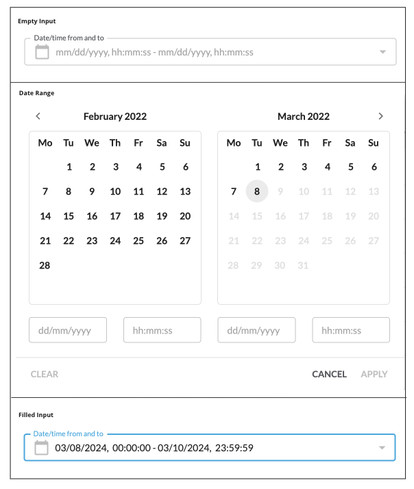
The layout displays two calendar components and navigation icons.
- The current month (on the left)
- The next month (on the right)
It also contains 2 text fields below each calendar component:
- Date
- Time
Date Field
The date field format depends on the preferred browser language. The default format is
`dd/mm/yyyy`- dd – Day
- mm – Month
- yyyy - Year
Supported date formats
Preferred browser language | Date format |
English (United Kingdom)/English (Australia) | dd/mm/yyyy |
English (United States) | mm/dd/yyyy |
English/French (Canada) | yyyy/mm/dd |
Other languages | dd/mm/yyyy |
The following validation for calendar format is applied:
- dd - Allowed values from 01 to 31 (Days from 1 to 9 are displayed prefixed with 0 (e.g. 01 / 07 / 2021 )
- mm - Allowed values from 01 to 12
- yyyy - Allowed values from 1970 up to the current year
The possibility of selecting a date in the future is set by the property
`disableFuture`Time Field
The time field has the following format
`hh:mm:ss`- hh – Hours
- mm – Minutes
- ss – Seconds
The following validations are applied:
- hh – Allowed values are from 00 to 23
- mm – Allowed values are from 00 to 59
- ss – Allowed values are from 00 to 59
The default time is applied for:
- The input field - 00:00:00
`from` - The input field - 23:59:59
`to`
Learn how to add new fields in Registering SDK Components.
Navigation Icons
The date and time range filter component contains
`<``>``<``>`Buttons Block
The buttons block contains the following buttons:
- Clear button:
The button is always visible but is enabled only when data is selected or entered. By clicking on the Clear button, all changes are reset.
- Cancel button:
The button is always visible and enabled. By clicking on the Cancel button, all entered values are cleared, and the component is closed.
- Apply button:
The button is always visible and enabled. By clicking on the Apply button, the component is closed, and the entered date and time (if selected or entered) are specified and displayed in the input form.
Properties
Name | Type | Required | Default | Description |
value | | no | none | Property sets initial dates. On date selection, the component returns the value in the ISO string format: Using the component in the workflow, the |
disableFuture* | | yes | false | Property sets the possibility of filtering data in the future. When the property is set to |
isError* | | no | false | Marks input as invalid with the red border. |
helperText* | | no | none | Helper text under the input field. |
minDate* | | no | none | Sets the minimum date available for selection in the calendar. |
maxDate* | | no | none | Sets the maximum date available for selection in the calendar. |
Properties marked * can be configured in a custom component only.
Workflow configuration allows only properties supported by workflow contracts.
1String name;
2String label;
3String type;
4String source;
5Object value;
6Object options;
7Object defaultValue;
8Boolean mandatory = false;
Language: java
Name: Workflow contract supported properties
Description:
Workflow contract supported properties
Configuration example
1{
2    "userActions": [
3    {
4        "context": [
5            {
6                "label": "Date",
7                "type": "SECONDARY",
8                "modules": [
9                    "adminconsole"
10                ],
11                "confirm": true
12            }
13        ],
14        "attributes": [
15            {
16                "name": "daterange",
17                "label": "Dates",
18                "type": "daterange",
19                "source": "",
20                "defaultValue": {
21                    "to": "",
22                    "from": ""
23                },
24                "mandatory": false
25                }
26            ]
27        }
28    ]
29}
Language: json
Version History
v1.0.0
Initial changelog entry.
24.4.29
The Date Range component is moved to the Mystique core. This enables its seamless integration into various Fluent applications. The
`disableFuture`Recommended Placement
This component was designed to be used when the date and time range filter is part of a form.
