Product Card Component
Changed on:
19 July 2024
Overview
The Product Card Component is a consistent way to represent product information across the applications. Alongside the typical card features it can also display an image, attributes, a count, and a close icon, while also allowing nested components for added functionality.
| Plugin Name | Core |
|---|
The standard library of mystique components.
v1.0.0
Initial changelog entry.
Alias
fc.card.product
Detailed technical description
Various child components can be placed inside the card to extend basic functionality. If composing the component with others is necessary, using the card without an indent will avoid extra spacing.
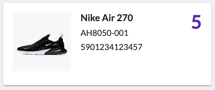
1{
2    "component": "fc.card.product",
3    "props": {
4        "title": "Nike Air 270",
5        "cardImage": {
6            "imageUrl": "https://c.static-nike.com/a/images/f_auto,b_rgb:f5f5f5,w_440/skwgyqrbfzhu6uyeh0gg/air-max-270-shoe-nnTrqDGR.jpg",
7            "width": "100px",
8            "height": "100px"
9        },
10        "width": 4,
11        "attributes": [
12            {"value": "AH8050-001", "label": "ref"},
13            {"value": "5901234123457", "label": "gtin"}
14        ],
15        "descendants": [
16            {
17                "component": "fc.accordion",
18                "props": {
19                    "noCard": true,
20                    "defaultExpanded": false,
21                    "summary": "Product Details",
22                    "details": "A blend of cutting-edge comfort and street-smart style, designed for those who demand peak performance and unmatched durability. Elevate your everyday look while enjoying cloud-like cushioning and unbeatable traction with every step."
23                }
24            }
25        ]
26    }
27}
Language: json
Name: Product Card with an Accordion inside
Description:
Product Card configuration with an accordion inside
Example:

Properties
Name | Type | Required | Default | Description |
title |
| no | none | The Title text of the card |
attributes | | no | [] | List of key/value pairs to show on the card |
count | | no | none | Number that is displayed in the to right corner of the card. |
cardImage | | no | none | An object containing image URL and dimensions (width and height) |
width | | no | 12 | Define the width of this card on a 12-column grid. Can use the named widths for readability or numbers directly. On mobile devices, all widths will automatically change to 12 for the best responsive experience. |
indent | | no | true | Card padding switcher. |
CardImageProperties
Name | Type | Required | Default | Description |
height | | no | - | Image height |
width | | mo | - | Image width |
imageUrl | | no | - | Image URL |
Configuration example
1{
2  "component": "fc.card.product",
3  "props": {
4    "title": "Nike Air 270",
5    "cardImage": {
6      "imageUrl": "https://c.static-nike.com/a/images/f_auto,b_rgb:f5f5f5,w_440/skwgyqrbfzhu6uyeh0gg/air-max-270-shoe-nnTrqDGR.jpg",
7      "width": "100px",
8      "height": "100px"
9    },
10    "width": 4,
11    "attributes": [
12      { "value": "AH8050-001"},
13      { "value": "5901234123457"}
14    ],
15    "count": 5
16  }
17}
Language: json
Version History
v24.7.22
The initial release
Recommended Placement
The component can be placed in pages, drawers, lists.