Adding Header Components to an OMX Web App (Store, OMS, Inventory etc)
Author:
Matt Salmon
Changed on:
24 July 2024
Key Points
- A step-by-step guide on how to add a custom help menu to the header to serve as inspiration for other custom components that can be added
Steps
 Customise your app manifest
This is an app-level setting. When adding a component to the STORE or OMS header bar, a customised manifest is required. The manifest name should follow the format
`fc.mystique.manifest.<web-app-name>`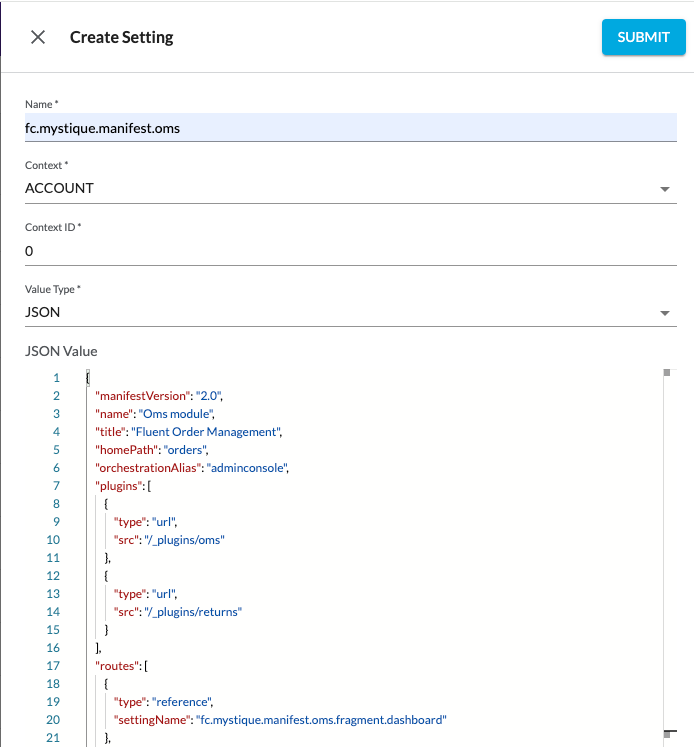
Build out the custom help menu component
First we will build out the new help menu to be included in the header. See below for some sample code to get you started.
1import { Box, IconButton, Link, Tooltip, Typography, useTheme } from '@material-ui/core';
2import { MdHelpOutline } from 'react-icons/md';
3
4export const HelpMenu = () => {
5  const { spacing } = useTheme();
6  return (
7    <Tooltip
8      arrow
9      interactive
10      title={
11        <Box css={{ padding: spacing(2) }}>
12          <Typography variant="body2">
13            For Store documentation click{' '}
14            <Link target="_blank" href="https://docs.fluentcommerce.com/essential-knowledge/stores">
15              here
16            </Link>
17          </Typography>
18        </Box>
19      }
20    >
21      <IconButton>
22        <MdHelpOutline color="white" />
23      </IconButton>
24    </Tooltip>
25  );
26};
27
Language: typescript
Name: Help Menu component code
Description:
[Warning: empty required content area]Make sure to add the component to the registry! Your export should look something like:
`ComponentRegistry.register(['custom.helpMenu'], HelpMenu, { category: 'content' });`Next we will add the header field into our root level manifest
To add components into the header bar you must first add the
`header``desktop``mobile``header`1{
2 "manifestVersion": "2.0",
3 "name": "store",
4 "title": "Fluent Store",
5 "orchestrationAlias": "servicepoint",
6 "homePath": "waves",
7 "header": {
8 "desktop": [
9 {
10 "position": "right",
11 "component": "custom.helpMenu"
12 }
13 ],
14 "mobile": [
15 {
16 "position": "right",
17 "component": "custom.helpMenu"
18 }
19 ]
20 },
21 "plugins": [
22 {
23 "type": "url",
24 "src": "/_plugins/store"
25 },
26 {
27 "type": "url",
28 "src": "/_plugins/returns"
29 }
30 ],
31 "context": {
32 "level": "location",
33 "role": [
34 "STORE_ASSISTANT",
35 "STORE"
36 ]
37 },
38 "routes": [
39 {
40 "type": "reference",
41 "settingName": "fc.mystique.manifest.store.fragment.waves"
42 },
43 {
44 "type": "reference",
45 "settingName": "fc.mystique.manifest.store.fragment.orders.awaitingpick"
46 },
47 {
48 "type": "reference",
49 "settingName": "fc.mystique.manifest.store.fragment.waves.inprogress"
50 },
51 {
52 "type": "reference",
53 "settingName": "fc.mystique.manifest.store.fragment.waves.complete"
54 },
55 {
56 "type": "reference",
57 "settingName": "fc.mystique.manifest.store.fragment.arrivals"
58 },
59 {
60 "type": "reference",
61 "settingName": "fc.mystique.manifest.store.fragment.customer.collections"
62 },
63 {
64 "type": "reference",
65 "settingName": "fc.mystique.manifest.store.fragment.carrier.collections"
66 },
67 {
68 "type": "reference",
69 "settingName": "fc.mystique.manifest.store.fragment.uncollected"
70 },
71 {
72 "type": "reference",
73 "settingName": "fc.mystique.manifest.store.fragment.returns"
74 }
75 ]
76}Language: json
Name: header code snippet
Description:
headerDescendants code snippet
There is no limit to the number of components that can be added, so screen size should be taken into account. Adding too many components may overrun onto adjacent components.
Now we will configure the position of the help menu
Component alignment can be specified using the
`position``position`1 "header": {
2 "desktop": [
3 {
4 "position": "right",
5 // other MystiqueComponentInstance properties
6 }
7 ],
8 "mobile": [
9 {
10 "position": "right",
11 // other MystiqueComponentInstance properties
12 }
13 ]
14 },Language: json
Name: header code with align snippet
Description:
headerDescendants code with align snippet
Finally we will add the component configuration
Add our
`HelpMenu`1 "header": {
2 "desktop": [
3 {
4 "position": "right",
5 "component": "custom.helpMenu"
6 }
7 ],
8 "mobile": [
9 {
10 "position": "right",
11 "component": "custom.helpMenu"
12 }
13 ]
14 },Language: json
Name: header code with HelpMenu configuration
Description:
headerDescendants code with descendant snippet
Results
The result of adding our help menu component will look like this on desktop:

And on mobile devices it will look like this:

Help menu animation:
