OMX Design System Foundations
Author:
Fluent Commerce
Changed on:
14 Aug 2024
Overview
The Order Management Experience (OMX) Design System provides guidelines for delivering a user experience tailored to the Omnichannel Order Management space. This article will describe the foundations of the Design System, including color palette and typography which make up the overarching design theme of the Fluent Commerce platform.
Key points
- The Fluent OMX Design System is based on Material Design 2, this article covers the exceptions & elements not included in this documentation.
- Learn about the Fluent Commerce color palette & typography through usage examples, recommended practices, and code samples.
Foundations Overview
This section lays down the foundation for the overarching design theme of the Fluent Commerce platform. To create visually clean and user-friendly interfaces, there are recommendations and guidelines on how the overarching Fluent design theme elements, such as Color and typography, should be used.
Color Palette
All Fluent Web Apps come with a built-in color palette that can be used for controlling the color system and theming.
These default colours include:
- Variants of Primary and Secondary colours
- Contextual messaging colors for alerts
- Additional UI colors for things such as; backgrounds, surfaces, dividers, and buttons.
The following colors can be referenced by name in places that would otherwise expect a color hex code.
1palette: {
2    primary: {
3      light: '#effbff',
4      main: '#00A9E0',
5      dark: '#027ECE',
6      contrastText: '#FFFFFF'
7    },
8    secondary: {
9      light: '#FBF2FF',
10      main: '#552AA8',
11      dark: '#26005C',
12      contrastText: '#FFFFFF',
13    },
14    text: {
15      secondary: '#53565A',
16      hint: '#999',
17    },
18    background: {
19      default: '#FFF',
20    },
21    mystique: {
22      colours: {
23        structure: {
24          border: '#D4D6D8',
25        },
26        compliance: {
27          success: '#4CAF50',
28          warning: '#EF8F00',
29          error: '#D23B3B',
30        },
31        constants: {
32          white: '#FFF',
33          black: '#000',
34          lightgrey: '#F5F5F5',
35        },
36      },
37    },
38  },
Language: plain_text
Name: Color Palette CSS
Description:
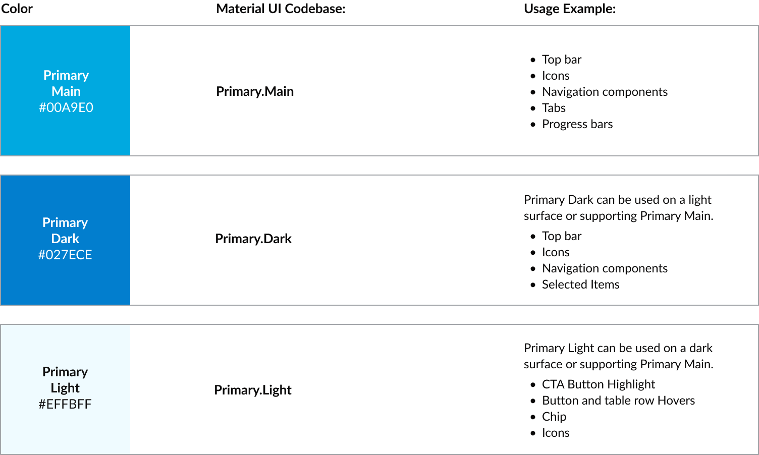
[Warning: empty required content area]Primary Color Palette
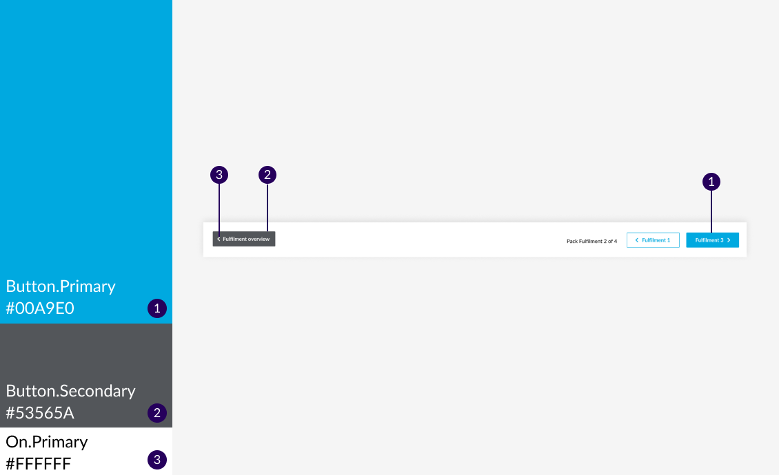
The color theme displayed most frequently in your WebApp. Use these to distinguish elements within a component, you can apply Primary Dark and Primary Light to provide more color variants.
Usage Examples
Primary color can be used in iconography, themed text, clickable text (for e.g. links), tags, top bar and navigation bar.
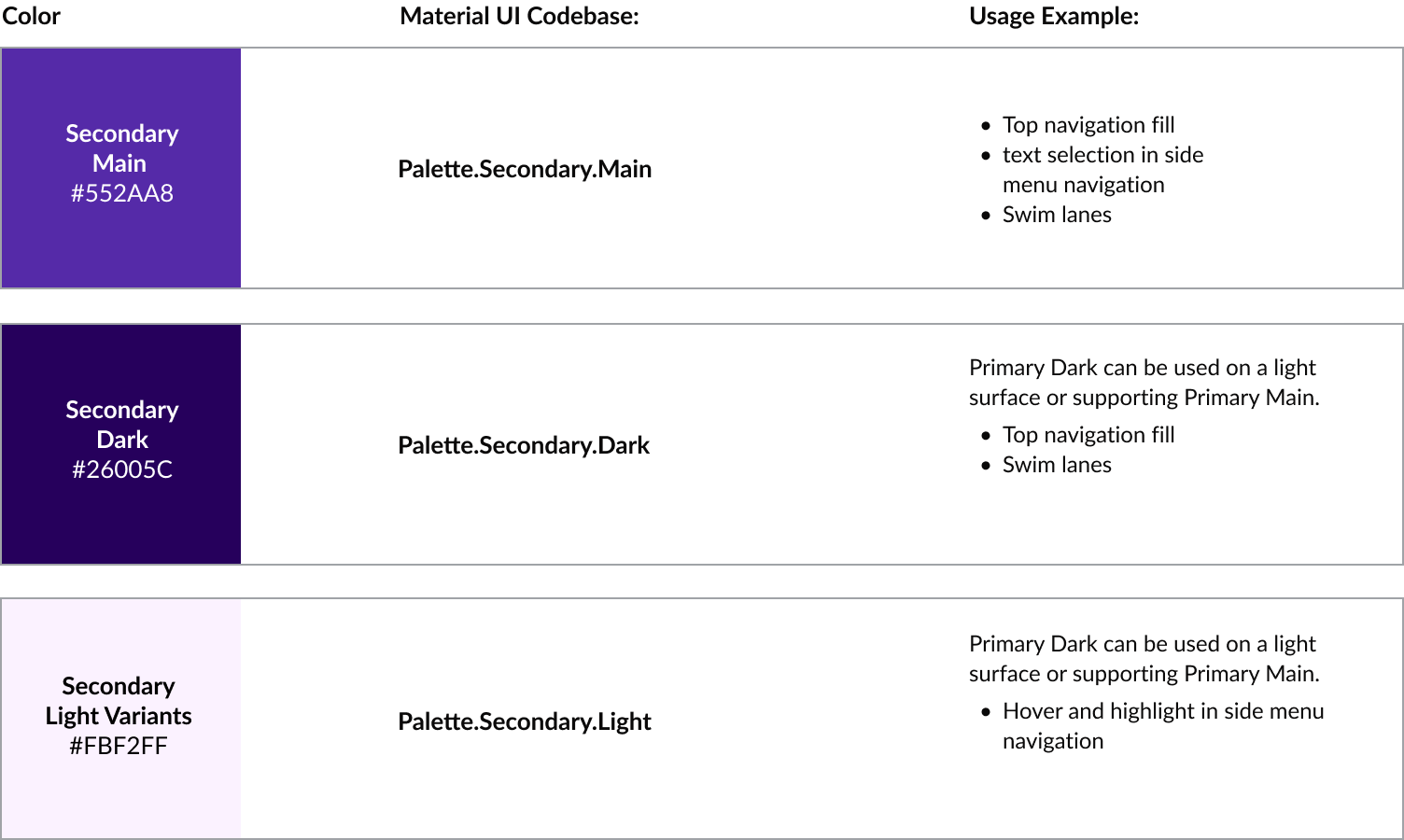
Secondary Color Palette
Secondary colors allow you to provide another way to distinguish your WebApps and select parts of the UI such as when hovering over a navigation menu item like below. You can apply Secondary Dark and Light to provide more color variants.
Usage Examples
Secondary colors can be used in sliders, switches, highlighting selected text, progress bars, links and headlines.
Reserved colors for Alerts
These colours are reserved for contextual messaging, they will only be applied on alert components.
Usage Examples
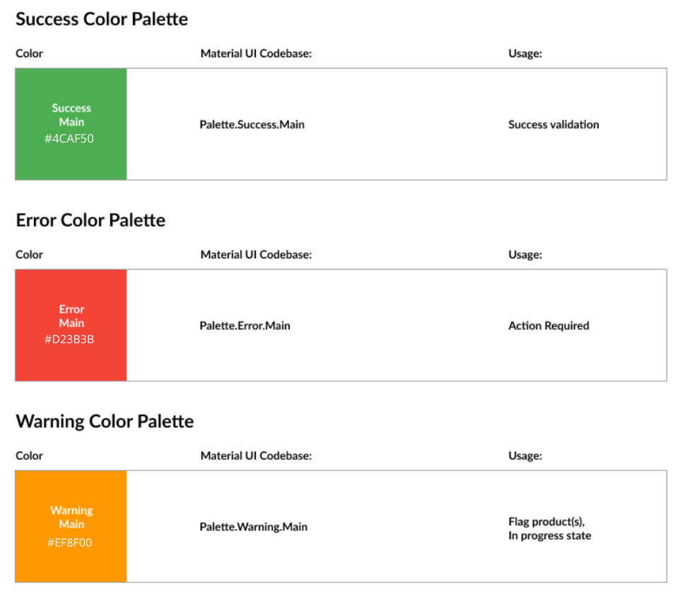
Success
Used to indicate the successful completion of an action that user triggered.
Error
Used to represent interface elements that the user should be made aware of.
Warning
Used to represent potentially dangerous actions or important messages.
Buttons, Texts, and Dividers
UI colors are available for Buttons, Text, and Dividers. The button color should always be a color that allows white color text and iconography to be applied on the surface with strong contrast.
Background, Surface, and Text on Background/Surface
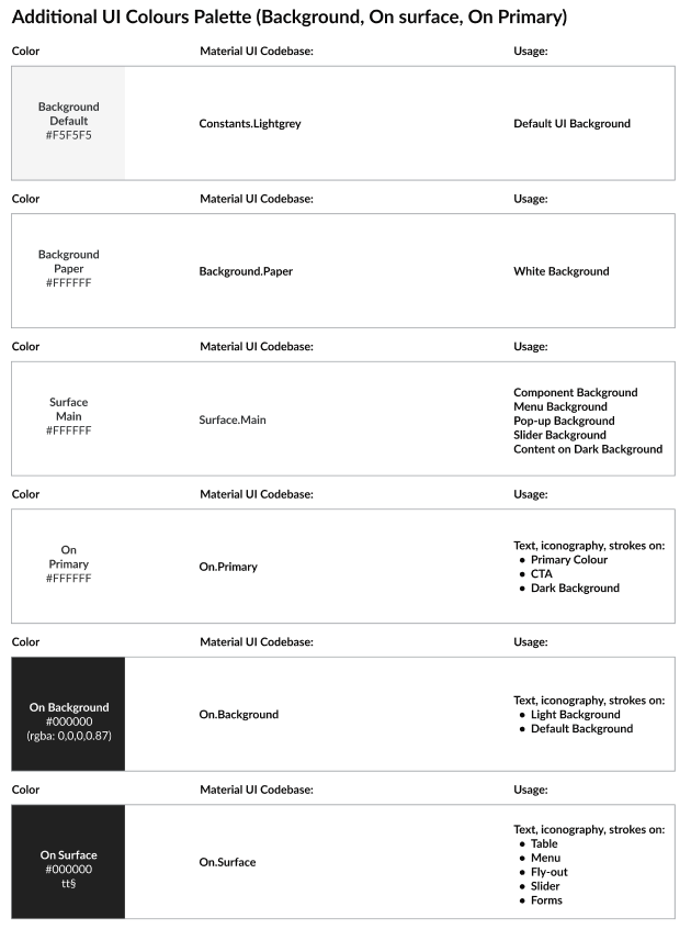
Background & Surface are usually in pure white in most scenario except the default base background color. This is to distinguish from other components and allow other colours to be applied on the surface or in the background.
Typography
The OMX Design System provides a set of typographic styles and guidelines for using the font. These styles have been mapped to their usage throughout the platform.
1const TypogStyles = (theme: Theme): Record<TypographyVariant, CSSProperties> => ({
2  'heading-1': {
3    fontSize: '20px',
4    lineHeight: '24px',
5    fontWeight: 400,
6  },
7  'heading-2': {
8    fontSize: '20px',
9    lineHeight: '24px',
10    fontWeight: 700,
11  },
12  'heading-3-title': {
13    fontSize: '16px',
14    lineHeight: '24px',
15    fontWeight: 400,
16    textTransform: 'capitalize',
17  },
18  'heading-3-uppercase': {
19    fontSize: '16px',
20    lineHeight: '24px',
21    fontWeight: 400,
22    textTransform: 'uppercase',
23  },
24  'heading-4': {
25    fontSize: '14px',
26    lineHeight: '20px',
27    fontWeight: 700,
28  },
29  'heading-5': {
30    fontSize: '13px',
31    lineHeight: '20px',
32    fontWeight: 700,
33    textTransform: 'uppercase',
34  },
35  'heading-6': {
36    fontSize: '14px',
37    lineHeight: '16px',
38    fontWeight: 400,
39    color: theme.palette.text.hint,
40  },
41  'body-1': {
42    fontSize: '14px',
43    lineHeight: '24px',
44    fontWeight: 400,
45  },
46  'body-2': {
47    fontSize: '16px',
48    lineHeight: '24px',
49    fontWeight: 700,
50    color: theme.palette.text.secondary,
51  },
52  'small-text-1': {
53    fontSize: '12px',
54    lineHeight: '16px',
55    fontWeight: 400,
56    color: theme.palette.text.hint,
57  },
58  'small-text-1-bold': {
59    fontSize: '12px',
60    lineHeight: '16px',
61    fontWeight: 700,
62    color: theme.palette.text.hint,
63  },
64});
Language: plain_text
Name: Typography Theme CSS
Description:
[Warning: empty required content area]Fluent Commerce Typography Theme
Style and CSS | Usage |
Heading 1 fontSize: 20px |
|
Heading 2 fontSize: 20px |
|
Heading 3 - title fontSize: 16px textTransform: capitalize |
|
Heading 3 - uppercase fontSize: 16px textTransform: uppercase |
|
Heading 4 fontSize: 14px |
|
Heading 5 fontSize: 13px textTransform: uppercase |
|
Heading 6 fontSize: 14px color: theme palette text hint |
|
Body 1 fontSize: 14px |
|
Body 2 fontSize: 16px color: theme palette text secondary |
|
Small text 1 fontSize: 12px color: theme palette text hint |
|
Small text 1 - bold fontSize: 12px color: theme palette text hint |
|