Author:
Valery Kornilovich
Changed on:
5 July 2024
 Overview
Quick search allows the use of a specific component to make a quick search through the data on the page (usually in a list component). It is designed to be “as few clicks as possible” to navigate throughout the data and open the single page with the information you are looking for (order/customer/etc.).
Use caseAs a customer service representative (or store assistant) I’d like to have the ability to jump into the information page using as few clicks as possible, when on the phone with the customer. When we are talking about specific orders, or I’m trying to find the customer page.
Solution ApproachThe Quick Search bar is an essential tool that allows users to efficiently locate information by entering relevant keywords or phrases. This functionality is not only a time-saver but also significantly enhances user experience. The approach to implementing a Quick Search feature involves several key considerations:
By focusing on these core aspects, the Quick Search bar will serve as a powerful tool for users to swiftly find the necessary information, contributing to a more productive and user-friendly environment.
UI Component1ComponentRegistry.register(['fc.se.quick.search'], QuickSearch, {
2 category: 'content',
3});Language: typescript
Name: Component Registration
Description:
Example of registration of component
Name | Type | Required | Default | Description |
label | string | yes |
| Label for the component. Will be run through the TemplateRender, so you can add dynamic variables or other renders here. |
linkTemplate | string | no | undefined | Template for the link to be used when the user presses “Enter” if there is only one entry. |
data | any | no | undefined | Data to be used in searching through. In the manifest, you should use dataSource as a string value to provide the converted data object later on. |
variable | string | yes |
| The variable that is used to filter the current data source on the page. You can use it as a variable of GraphQL query or as a synthetic variable, that is automatically generated when the page engine executes the query (for example orders_ref, where a query is named orders and there is a field inside called ref). |
autoFocus | boolean | no | true | Flag for autofocusing the component. |
responsiveness | ResponsiveCardWidth | no | | Responsiveness constraint for the component. |
predefinedFilters | MystiqueComponentInstance[] | no |
| An array of MystiqueComponents will be added to a menu of “Predefined Filters”. Can be any component, but usually use |
Manifest changes1{
2 component: 'fc.se.quick.search',
3 props: {
4 linkTemplate:
5 '#/orders/{{node.id}}/{{node.retailer.id}}/{{node.ref}}',
6 dataSource: 'orders',
7 variable: 'orders_ref',
8 label: 'Order Ref'
9 },
10}Language: typescript
Name: Example of component usage
Description:
Example of component usage
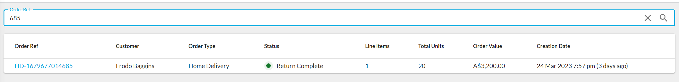
ResultComponent after loading the page
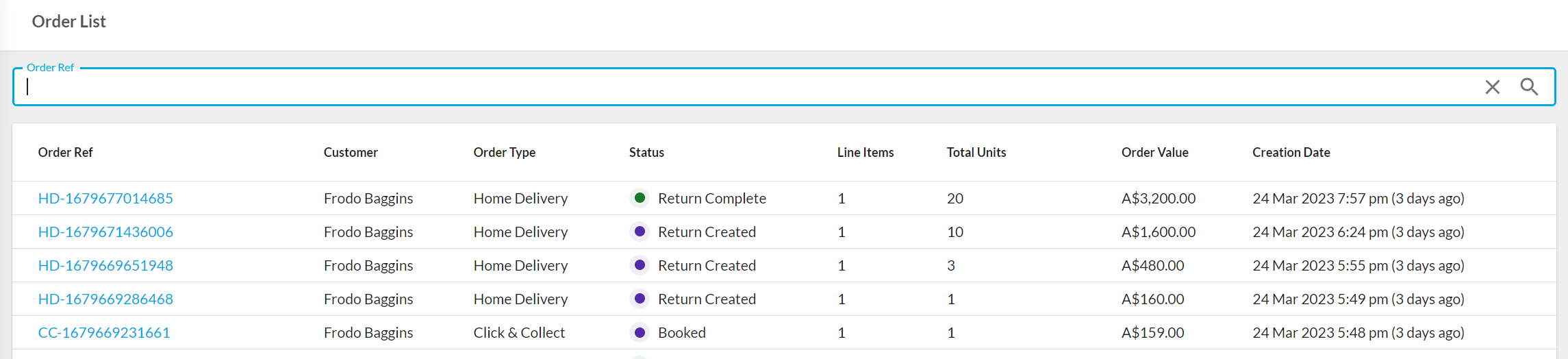
Multiply quick search component on one page
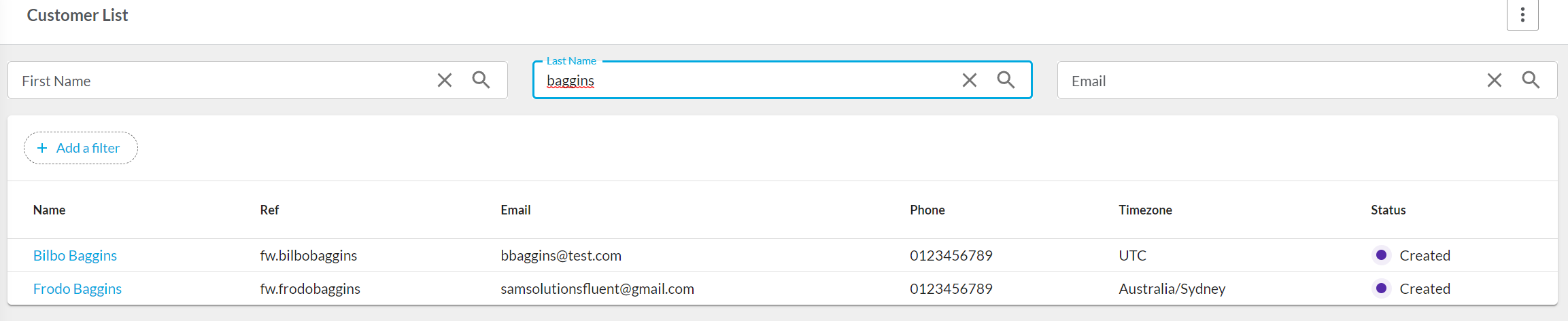
Filtering data list
 Related Sources
Copyright © 2025 Fluent Retail Pty Ltd (trading as Fluent Commerce). All rights reserved. No materials on this docs.fluentcommerce.com site may be used in any way and/or for any purpose without prior written authorisation from Fluent Commerce. Current customers and partners shall use these materials strictly in accordance with the terms and conditions of their written agreements with Fluent Commerce or its affiliates.