New UX Components & Improvements to Existing Ones
Release
Author:
Yulia Andreyanova
Changed on:
19 July 2024
| Target release date: | 2024-07-22 |
|---|---|
| Release status: | Released |
Description
Several new components and enhancements to existing ones have been introduced to enable OMX Builders to provide even better UX experiences in Fluent Store and OMS.
New components include:
- The Repeater Component, which enables OMX Builders to display a set of components once per item in an array or connection.
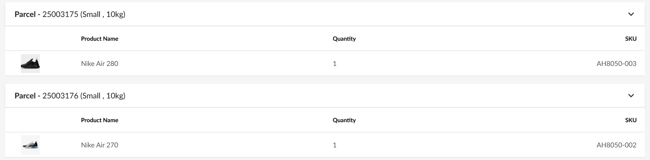
- The new Product Card component provides the ability to display related information alongside the product image in a card. Use this to display items in an Order or Article in a simplified manner that allows Store Associates to quickly digest important information about a particular product.
- Expanding on the Product card, the Image Card is a new component that can take in additional components and display them alongside an image. For example, embed an expandable accordion containing further information alongside a Product that Store Associates can expand when they need to dive deep.
Improvements to existing components:
- The Accordion Component now features an indent property to remove extra padding when used with nested components, improving the legibility when used in apps.
- Updates to the List component offer greater flexibility to the OMX builder in how the List will appear on mobile and desktop resolutions.
Changelog
- A new component fc.repeater has been added. The Repeater component allows you to display a set of components once per item in an array or connection. This is helpful for displaying for usecases where you need to display information in an intuitive manner that is repeated for each element in an array.
- The fc.accordion component has been extended with the indent property, which allows the removal of the extra padding in the Details section when using nested components.
- A new component, fc.card.product, has been added to the core. The component can display an image, attributes, a count, and a close icon. Additionally, it allows other components to be nested inside, making it ideal for creating complex layouts and improving the user experience.
- The fc.list component has been extended to provide advanced options for fine-tuning displayed elements within and
`row component mobile`properties.`row component desktop` - A new component, fc.card.image, has been added to the core. This versatile card, primarily featuring an image, is designed to hold descendants such as buttons, links, and attributes.
Screenshot
Gallery screenshots

| Released capability depth: | New capability, Enhancement |
|---|---|
| Release bundle / Capability type: | Web apps, Platform |
